Summary
Interswitch Group's three flagship payment products Verve, Quickteller, and Interswitch shared no design infrastructure. All three had evolved over years of independent product development, each carrying their own ad-hoc component decisions, colour overrides, and inconsistent spacing systems.
I designed and built Switch Core 2.0: a multi-brand design system in Figma that gives all three products a shared foundational layer while preserving the distinct visual identities that each brand requires. Across 14 months, the system grew to cover token architecture, a full component library, and per-component documentation built to a professional standard.
Three brands. No shared foundation. The same problem building three times.
Interswitch Group operates multiple payment products under its umbrella. Verve, Quickteller, and Interswitch are the three largest, and despite being sister products under the same group, they were designed in complete isolation. Different files, different components, different spacing logic. Every design decision made for one had to be independently recreated for the other two.
This created compounding costs: duplicated design effort across every feature, inconsistent product quality between the three brands, and no path to scaling without tripling the work. As design lead across all three products, I was in a position to see the full picture and to fix it at the root over a 14-month build.
"We were designing the same button in two places, making different decisions each time, and wondering why the products felt like they didn't belong to the same company."
Internal design team retrospective, 2024.The goal of Switch Core 2.0 was not to make both products look identical. It was to give them a shared foundation — one token architecture, one component library — while preserving the distinct visual character that each brand needs to serve its users.
What was breaking down
Before any architecture decisions were made, I documented the full state of both product design files. The audit surfaced five recurring failure modes that the system needed to resolve:
The architecture decision — how to structure a multi-brand system
The core architectural question: how do you build a single design system that serves two brands with different visual identities — without forcing one brand to look like the other, and without maintaining two separate systems?
I evaluated two structural approaches before committing to a direction:
Approach A — Shared primitives, brand-scoped semantic tokens
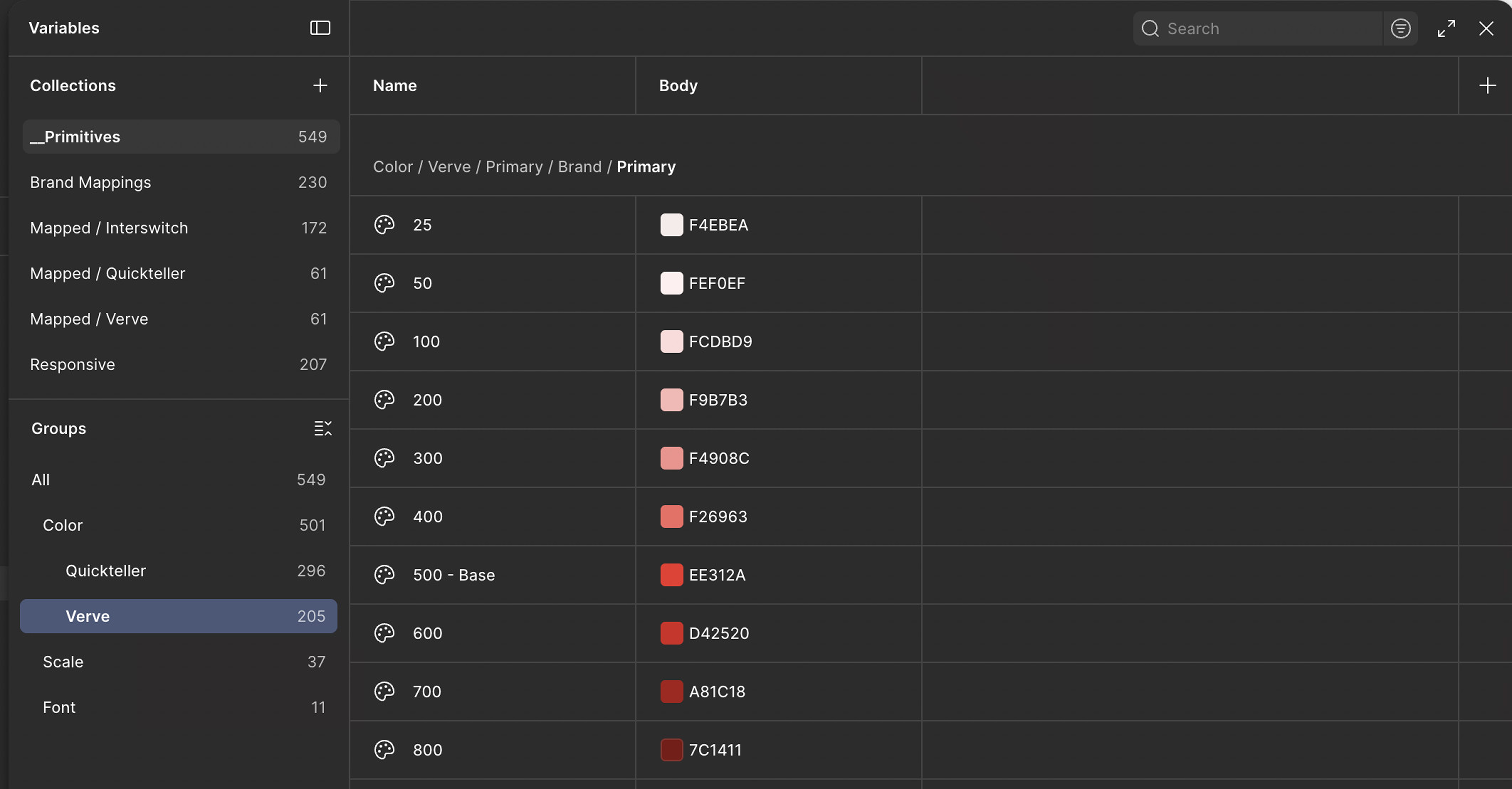

One primitive layer shared across both brands. Semantic tokens alias into it per-brand — so color.brand.primary resolves to teal for Verve and amber for Quickteller. Components consume semantic tokens only — brand switching is automatic and instantaneous.
Approach B — Parallel systems with a shared base file
A base Figma file containing shared utilities, and two separate brand files that inherit from it. Cleaner separation of concerns, but introduces file dependency complexity, harder to synchronise, and doubles the component maintenance surface for the design team.
Approach A was selected. The alias chain model kept the system in a single file, made brand theming automatic at the semantic layer, and required no additional file management overhead for the team. Brand distinctiveness was preserved through the semantic tier — not by maintaining separate codebases.
Three tiers. 1,306 variables. One source of truth.
The token architecture is the foundation the entire system rests on. Getting this layer right meant every component, every brand theme, and every future product could be maintained and extended without rework.
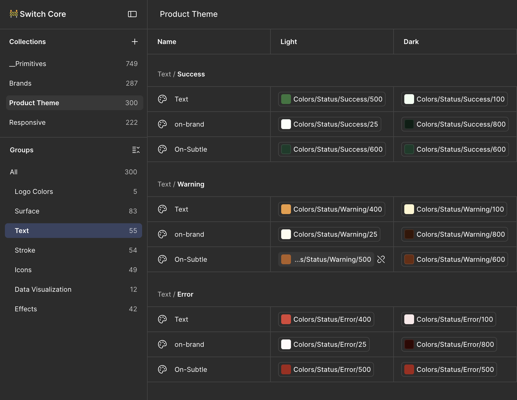
color.surface.default, color.text.muted, color.brand.primary. Three sets — one per brand. This is where Verve, Quickteller, and Interswitch diverge.
button.bg.primary, card.border.radius. These alias into semantic tokens, so brand switching cascades automatically.
All 1,306 variables live in six Figma variable collections: Primitives, Semantic/Verve, Semantic/Quickteller, Semantic/Interswitch, Component, and Mode (light/dark). Switching a component across all three brands is a single mode swap — no manual recolouring.
One foundation. Three identities.
The semantic token layer is where the three brands diverge. All three consume the same primitive palette but their semantic aliases resolve to different values, producing distinct visual identities while sharing the same component architecture underneath.
Confident. Grounded. Distinctly African.
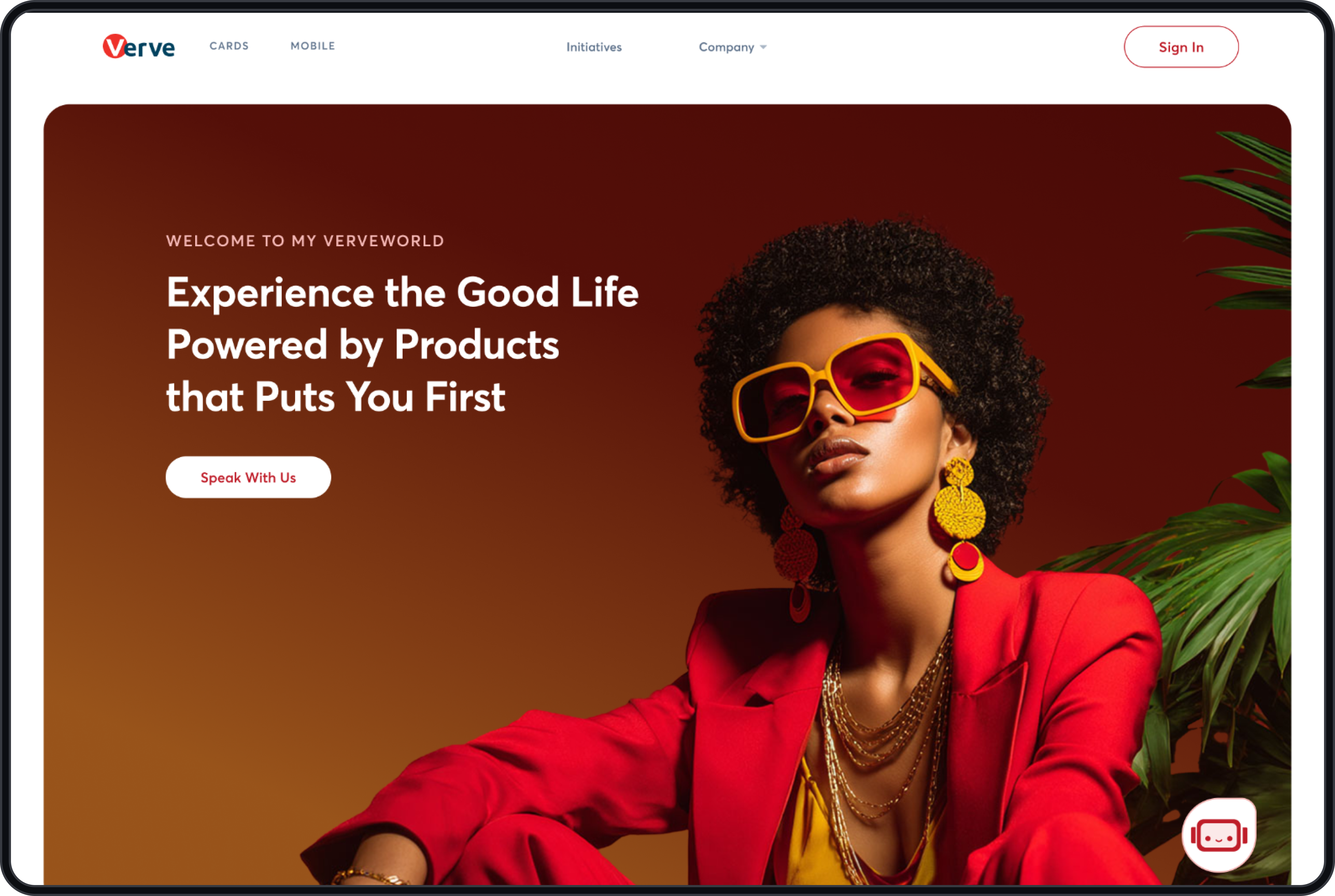
Deep teal primary, high-contrast surfaces, typographic trust signals. The product context is financial every visual decision earns its place by making the interface feel reliable.
Warm. Approachable. Everyday payments.
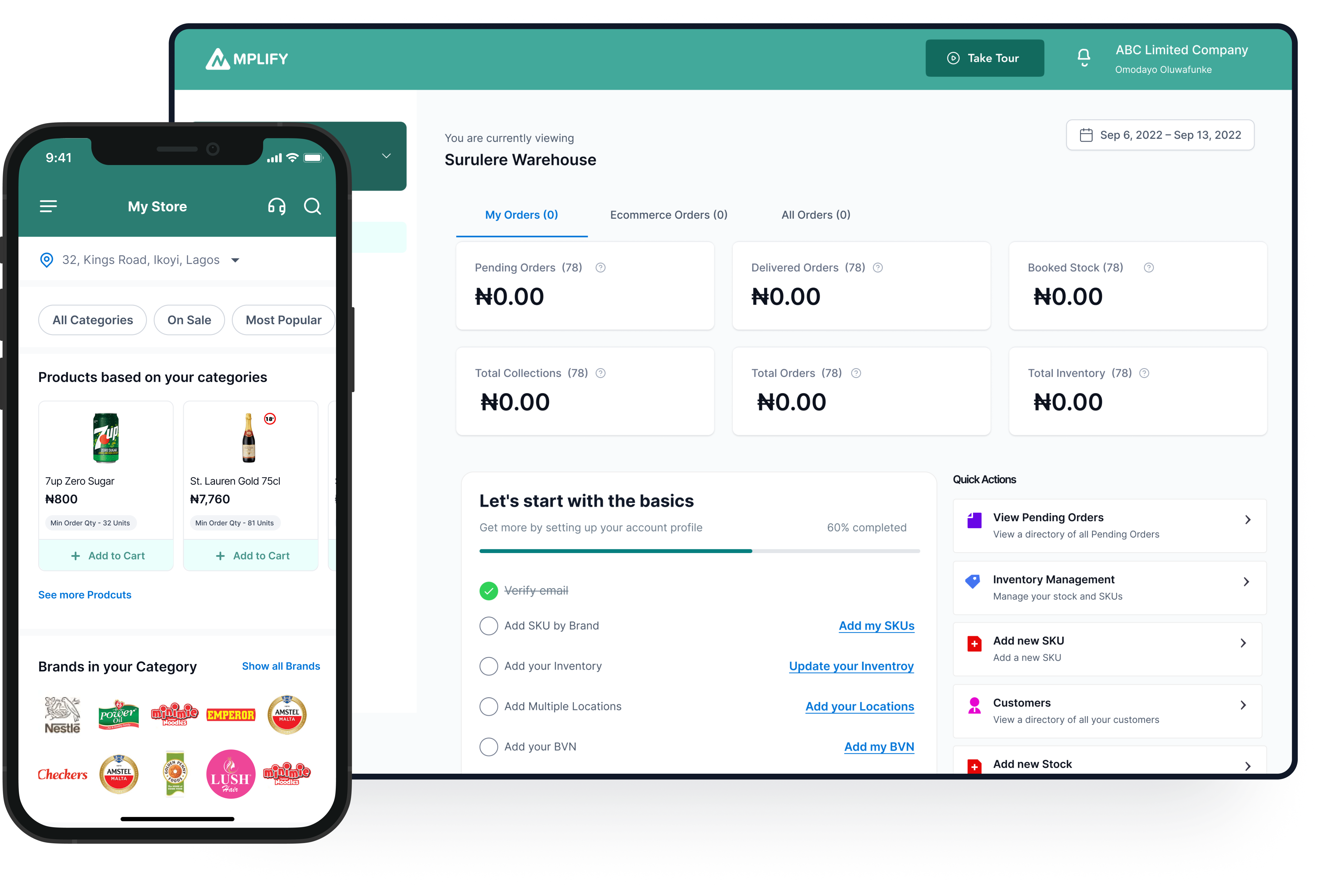
Warm amber primary, lighter surface weights, slightly more expressive rhythm. Consumer-facing the visual language needs to feel accessible and familiar to everyday users.
Authoritative. Institutional. Enterprise-grade.
Deep navy primary, structured surfaces, high information density. B2B and enterprise-facing the system needs to communicate scale, security, and professional competence above all else.
Six component sets at launch
Components were built in priority order highest frequency of use across both products first. Each component was built to support all required states, documented with a dedicated documentation page, and validated against both brand themes before being marked production-ready.
Every component documented. Every decision explained.
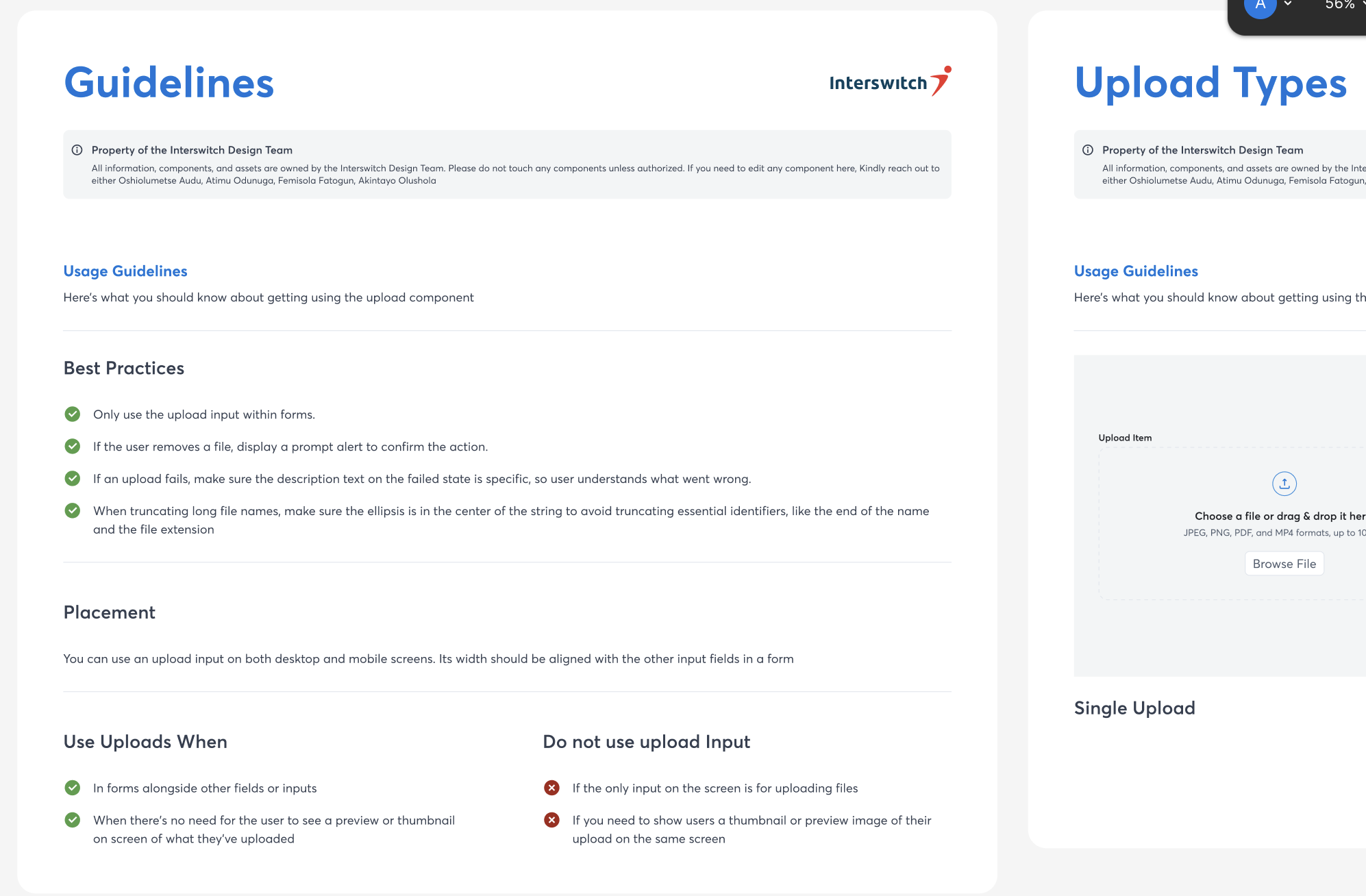
One of the failure modes of previous component libraries at Interswitch was the absence of documentation. Components existed but their intent, variants, states, and usage rules were all implicit knowledge held by whoever built them.
Switch Core 2.0 ships with a full documentation page per component, modelled on professional standards. Each page covers: the component's purpose and when to use it, all variants and their use cases, interaction states, accessibility notes, and usage examples showing correct and incorrect application.
"Before this, onboarding a designer meant two weeks of 'just look at existing screens'. Now there's a reference. That alone changes how the team functions."
— Design team feedback, Interswitch Group, 2024.How the system was built
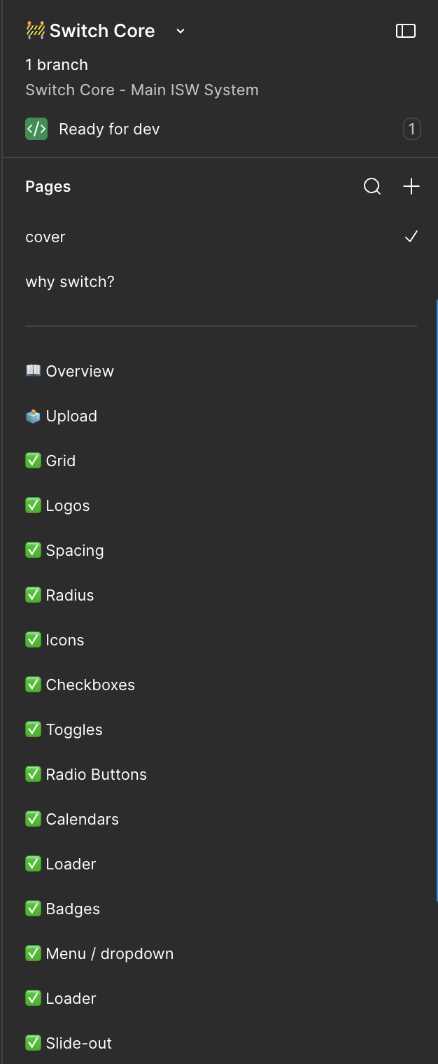
The 14-month build followed a structured sequence: foundations before components, tokens before styles, shared infrastructure before brand-specific themes. Skipping any step would have required rework downstream.
What the system made possible
Switch Core 2.0 shipped to the Verve, Quickteller, and Interswitch design teams at the end of the 14-month build. The immediate impact was structural it changed how all three teams work, not just how the products look.
Brand switching became instantaneous. A component that previously required manual recolouring to move between brand contexts now switches in a single Figma variable mode swap. Designers stopped context-switching between three files to check what "the same thing" looked like across brands.
Component coverage went from incomplete to comprehensive. Both product teams previously operated with partial, undocumented component libraries. Switch Core 2.0 gave them a complete, documented foundation with clear paths to extend it without breaking the shared layer.
Onboarding a new designer became measurably faster. With documented components and a structured token system, new team members could read the system and understand the design language rather than reverse-engineering it from shipped screens.