Overview
Summary
I led a team of five designers to unify Verve's six independently-built digital products under a single visual identity system, using the Aesthetic Usability Effect as a strategic framework to solve a measurable trust deficit across the entire product ecosystem.
Six products. No shared design language. A brand that users couldn't consistently recognise. The work covered a full discovery and audit phase, root cause analysis, identity definition, a ground-up design system, and parallel redesigns of all six products from the consumer website to the internal agent banking platform.
73%
Brand recognition failure merchant users shown the portal and website side-by-side couldn't identify them as the same brand.
4.2×
More support tickets generated by navigation confusion and UI inconsistency than by actual product errors. 3-month support ticket analysis.
0.17%
Cross-product engagement almost no users moved between Verve products in the same session. MS Clarity, 3-month period.
6
Digital products zero shared component definitions before this project. Complete design debt across the entire ecosystem.
s
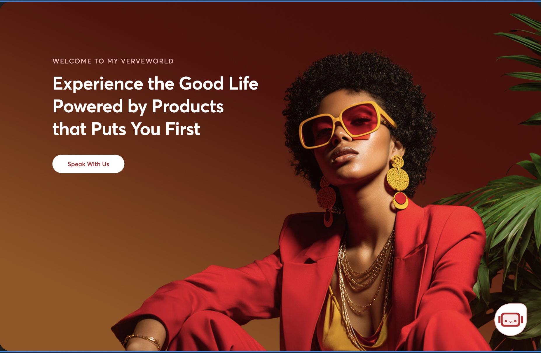 Image — Hero visual / before-after brand reveal
Recommended: 1600 × 900px · PNG or WebP
Image — Hero visual / before-after brand reveal
Recommended: 1600 × 900px · PNG or WebP
Context
Africa's largest domestic payment card, six products, no shared identity
Verve is Interswitch Group's flagship payment card, Africa's most widely used domestic card with over 100 million active cardholders. Since launch, Verve had grown from a single payment card into a multi-product digital ecosystem.
But unlike the card itself which had a singular, clear purpose, the digital products around it had grown independently, shaped by different teams, different timelines, and different constraints. When features couldn't fit into existing products, new ones were created instead. The result was six products that worked, but didn't belong together.
verveafrica.com - WebsiteConsumer
Verve Access - Card Issuance PlatformEnteprise
Verve Safetoken - Safetoken code platformEnteprise
Management Dashboard - Insight into all Verve ApplicationsInternal
Verve Loyalty - A loyalty rewards program Enteprise
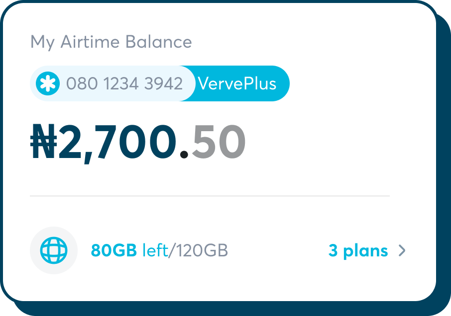
Verve Mobile AppConsumer
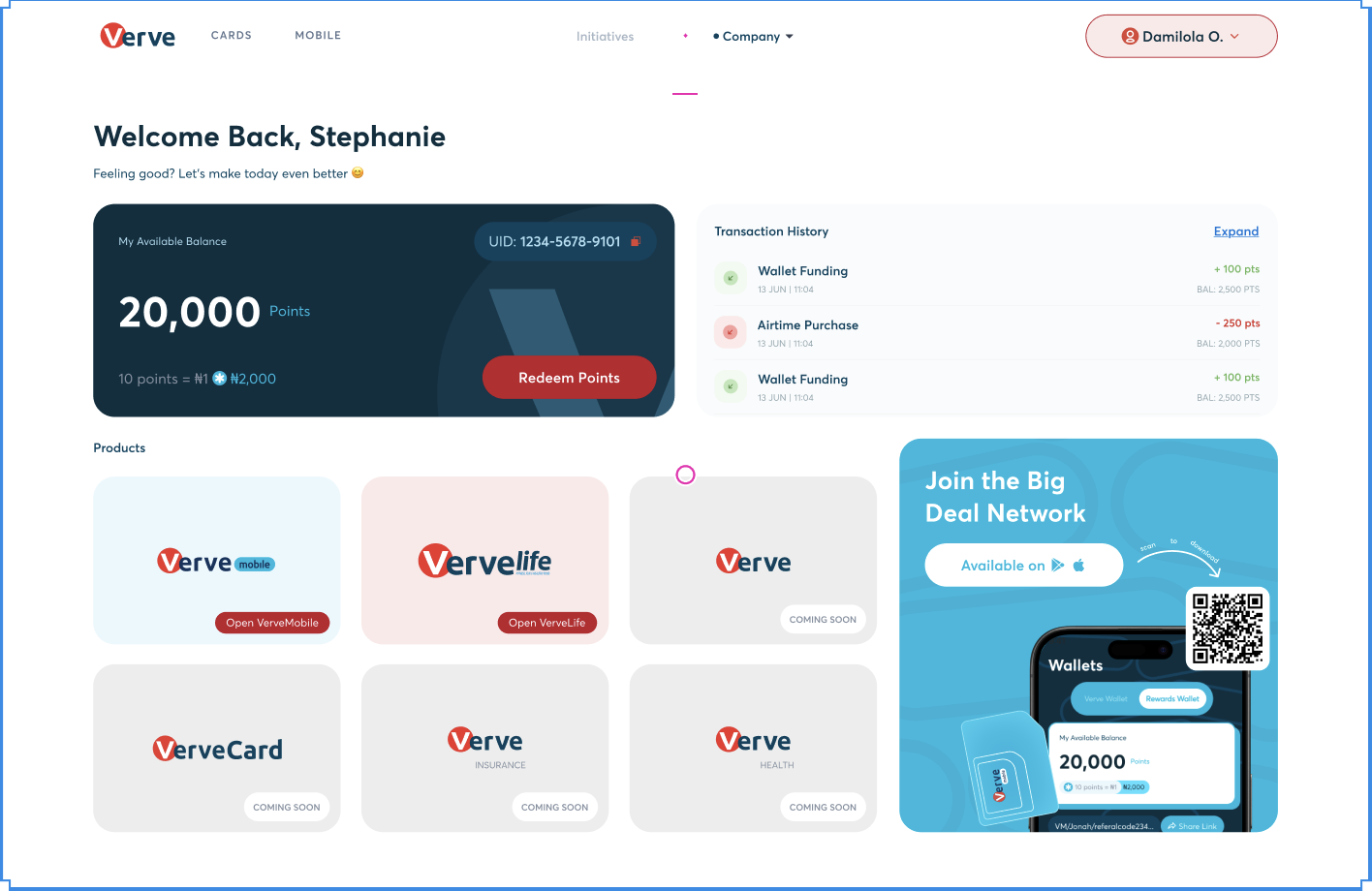 Image — 6 products before unification
Side-by-side screenshots showing visual fragmentation · 2400 × 1000px
Image — 6 products before unification
Side-by-side screenshots showing visual fragmentation · 2400 × 1000px
Discovery
Starting with the data
Before defining any design direction, I needed to establish a quantified baseline. I began with a full product audit across all six digital products, supplemented by behavioural data from Microsoft Clarity, user interviews with 18 participants across consumer, merchant, and agent segments, and an internal survey of the engineering and customer support teams.
Signal
Description
Value
Monthly sessions
Unique sessions across the merchant portal per month
3,876,400
Exit rate on landing
Sessions ending on first page without any meaningful interaction
61%
Navigation rage clicks
Instances of users clicking UI elements that didn't respond as expected
53,320/mo
Avg. session duration
Average time per session — below expected for a task-based product
5m 42s
Cross-product navigation
Sessions where users moved to or from another Verve product
0.17%
"I thought the merchant portal and the Verve website were two different companies. I only realised they were both Verve when I saw the card logo in the corner."
— Merchant interview participant, Lagos. Verve POS user, 2+ years.
 Research synthesis artifacts
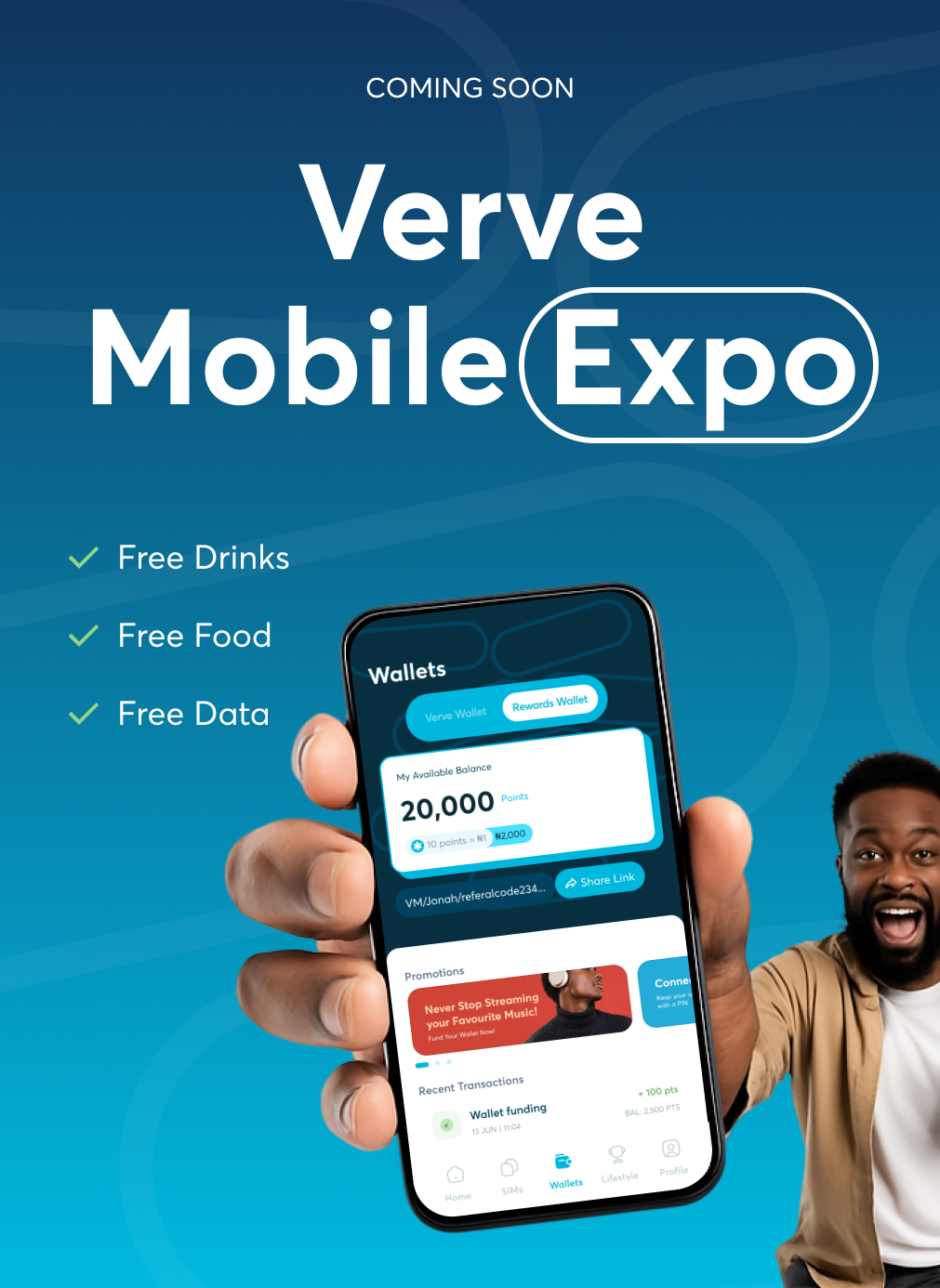 Image — User persona
Primary persona created from research data
Image — User persona
Primary persona created from research data
Root Cause Analysis
What was actually causing the trust gap?
After synthesising data from the audit, Clarity analysis, user interviews, and stakeholder sessions, I ran a structured root cause analysis to move from symptoms to structural cause. The data pointed at a surface-level problem, Poor user experience but there was something deeper underneath.
Session recordings and interview data indicated that users weren't confused by individual features, they were confused by the product landscape itself. Every product looked and felt like it came from a different company. The fragmentation wasn't a feature problem. It was a systemic design identity failure.
Symptom
Low cross-product trust. Users don't feel the products belong to one brand they can rely on.
↓
Caused by
Perceived quality inconsistency. Each product looks different, some polished, some not. Signals unreliability before a single task begins.
↓
Caused by
No shared visual language. Different type scales, colour values, spacing systems, and UI patterns across all 6 products.
↓
Root cause
No centralised design identity system. Products were built independently with no shared foundations, guidelines, or component library. Every team made reasonable local decisions. Those decisions accumulated into a globally incoherent experience.
The fix wasn't cosmetic it required building a design system from scratch and applying it across every product simultaneously, under a single coordinated design direction.
Strategic Framework
Rebuilding trust through design, the Aesthetic Usability Effect
With the root cause identified, I anchored the strategy in the Aesthetic Usability Effect the well-documented principle that users perceive more aesthetically pleasing interfaces as easier to use and more trustworthy, even before interacting with them. First described by Kurosu and Kashimura (1995).
In fintech, user trust is the primary product. The research showed clearly that visual quality was directly influencing how users perceived reliability. Treating visual quality as a trust infrastructure decision not a cosmetic one was what allowed me to align stakeholders on investing time in design system and identity work before any screens were redesigned.
"Users perceive more aesthetically pleasing designs as easier to use even before they've completed a single interaction with them."
— Kurosu, M. & Kashimura, K. (1995). Apparent Usability vs. Inherent Usability. CHI '95 Conference Companion.
I mapped the user's journey through Verve's ecosystem into four stages, and defined a design strategy for each that would leverage the Aesthetic Usability Effect at every touchpoint.
01
Exposed
First encounter
User first encounters any Verve product. Focus: Brand presence- the first impression has to signal quality before any task begins.
02
Perceives
Forms impression
User judges the product's quality and competence in milliseconds. Focus: Visual quality - typographic rigour, colour coherence, spatial rhythm.
03
Trusts
Decides to engage
Visual coherence across all touchpoints reinforces the decision to engage deeply. Focus: Consistency - same system, every product.
04
Returns
Adopts habitually
User adopts Verve's products as a regular part of their financial workflow. Focus: Memorability - a visual language strong enough to anchor recall.
Design Principles
The principles that guided every decision
After synthesising the research and discovery phase, I extracted five design principles — shared with, critiqued by, and agreed upon by the full design team and key stakeholders before a single pixel of the new identity was created.
◈
One Source of Truth
Every product in the ecosystem must pull from a single, centralised design token library and component system. No local overrides, no ad-hoc decisions. Consistency comes from having one shared foundation, not from reviewing work at the end.
✦
Aesthetics as Usability
Visual quality is a functional requirement, not a final-mile consideration. A polished interface reduces cognitive load, signals reliability, and lowers the threshold for user trust, especially in financial contexts where trust is the product.
◆
Distinctly Verve
The new visual identity must be unmistakably Verve — not a generic fintech aesthetic, not a Visa or Mastercard imitation. Africa's leading domestic card deserves a visual language that is confident, modern, and rooted in its own story.
⬡
Scalable by Default
The design system must accommodate products and features that don't exist yet. Every component, token, and pattern should be designed with extensibility in mind so that the next product built on Verve's stack inherits the identity automatically.
◉
Trust Through Consistency
Every visual inconsistency — a different button radius, an off-brand colour, a mismatched typeface — is a micro-signal of unreliability. Across 6 products and millions of touchpoints, those signals compound. Uniformity builds confidence; deviation destroys it.
Process
How we executed it — 6 months, 5 stages
As design lead, I managed the end-to-end design process from planning to delivery: establishing a systematic design approach, laying high-level design foundations, setting guidelines, reviewing work, managing stakeholders, and designing hands-on across all six products.
1
Discovery & Audit
Audited all 6 products screen-by-screen. Conducted user interviews, heuristic evaluations, and stakeholder workshops to establish a clear baseline and build shared understanding of the problem.
Weeks 1–5
2
Identity Foundation
Defined the core visual identity — colour system, typography, logo direction, spacing scale, and tone of voice. This became the non-negotiable north star that all six product workstreams would build from.
Weeks 6–10
3
Design System Build
Built the component library from the identity up: design tokens, primitives, patterns, and documentation. One source of truth for every product in the ecosystem, now and in the future.
Weeks 8–16
4
Product Execution
Redesigned all 6 products in parallel. Each designer owned their workstream, with weekly design crits and cross-product reviews to maintain visual coherence across the full ecosystem.
Weeks 12–22
5
QA & Handoff
Conducted cross-functional reviews, created full engineering handoff documentation, and established guidelines to ensure the system survived contact with development and became the permanent design standard.
Weeks 20–24
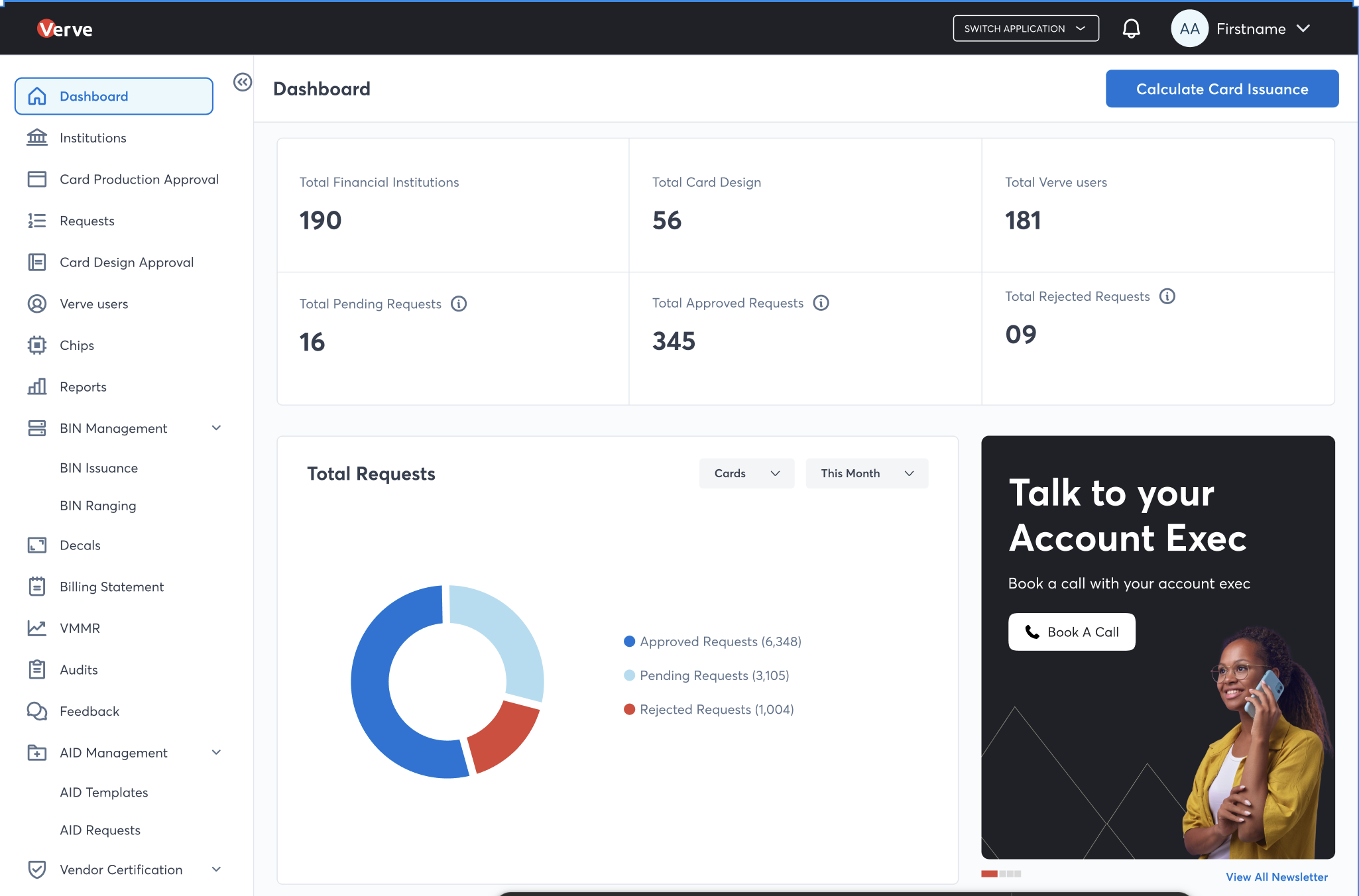 Image — Design system / token architecture
Figma token library, primitive to component · 1600 × 900px
Image — Design system / token architecture
Figma token library, primitive to component · 1600 × 900px
Visual Identity
Building a language that is unmistakably Verve
The identity work started with the core questions: what does Verve stand for visually, and how do we express that in a way that's distinctly African, distinctly fintech, and scalable across six different product contexts?
The resulting system established a three-tier token architecture — Primitives, Semantic, and Component tokens — 89 variables across five collections, a defined type scale, effect styles, and a unified colour palette that could flex across both consumer-facing and internal tooling contexts without losing brand coherence.
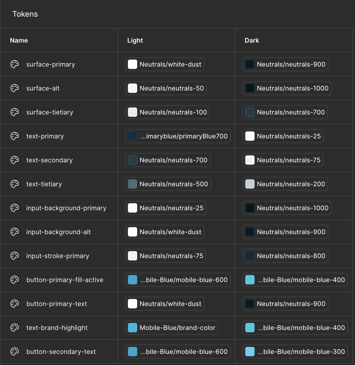 Image — Colour system
Primitive palette + semantic token mapping
Image — Colour system
Primitive palette + semantic token mapping
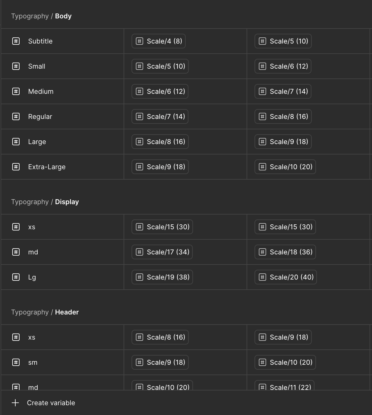 Image — Typography scale
Type system — display to caption
Image — Typography scale
Type system — display to caption
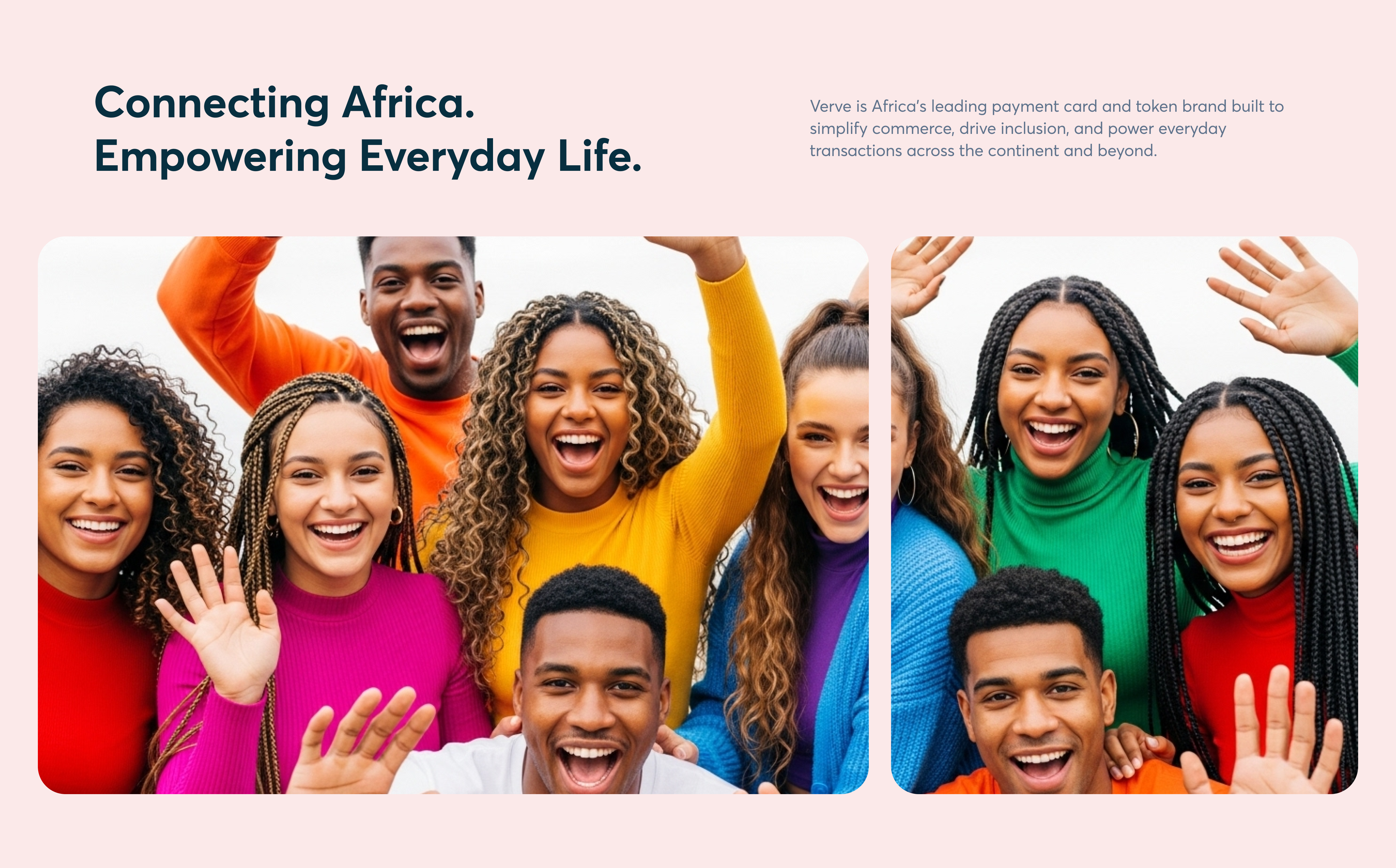 Image — Component library overview
Button, Card, Badge, Toast, Accordion, Avatar · 1600 × 900px
Image — Component library overview
Button, Card, Badge, Toast, Accordion, Avatar · 1600 × 900px
Product Execution
Redesigning all six products — in parallel
Each of the five designers owned a product workstream. My role was to design the consumer website and mobile app directly, set the visual standard for all workstreams, run weekly design crits, and make calls when there was tension between local product logic and the shared system.
The non-negotiables: every product used the same token library, the same component set, and the same spacing scale. Local decisions within that framework were permitted; local overrides of the foundational layer were not.
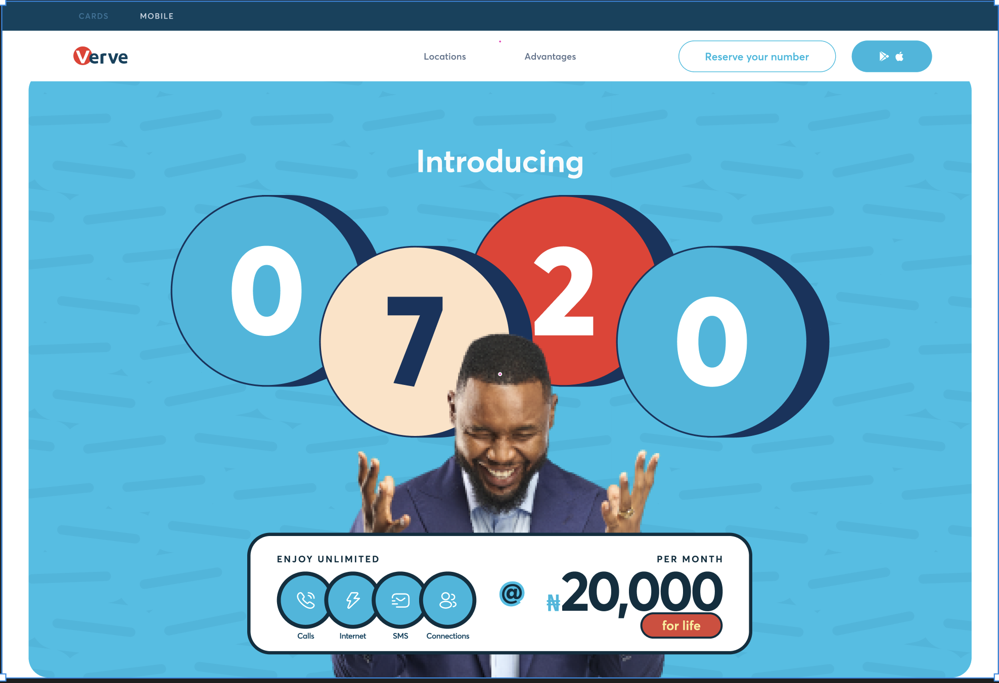 Image — verveafrica.com redesign
Homepage · desktop + mobile · 1600 × 900px
Image — verveafrica.com redesign
Homepage · desktop + mobile · 1600 × 900px
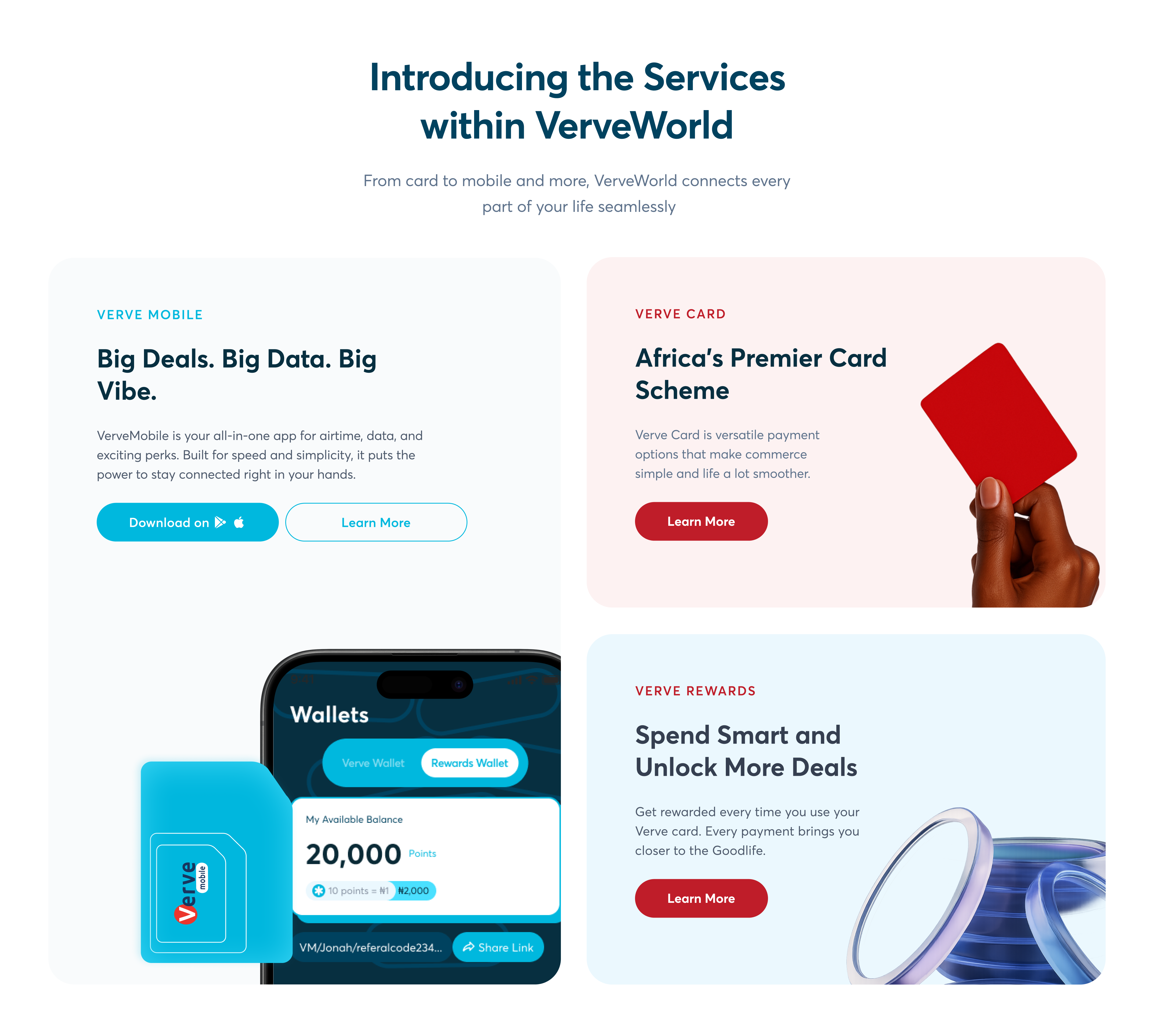 Image — Merchant portal
Dashboard + transaction view
Image — Merchant portal
Dashboard + transaction view
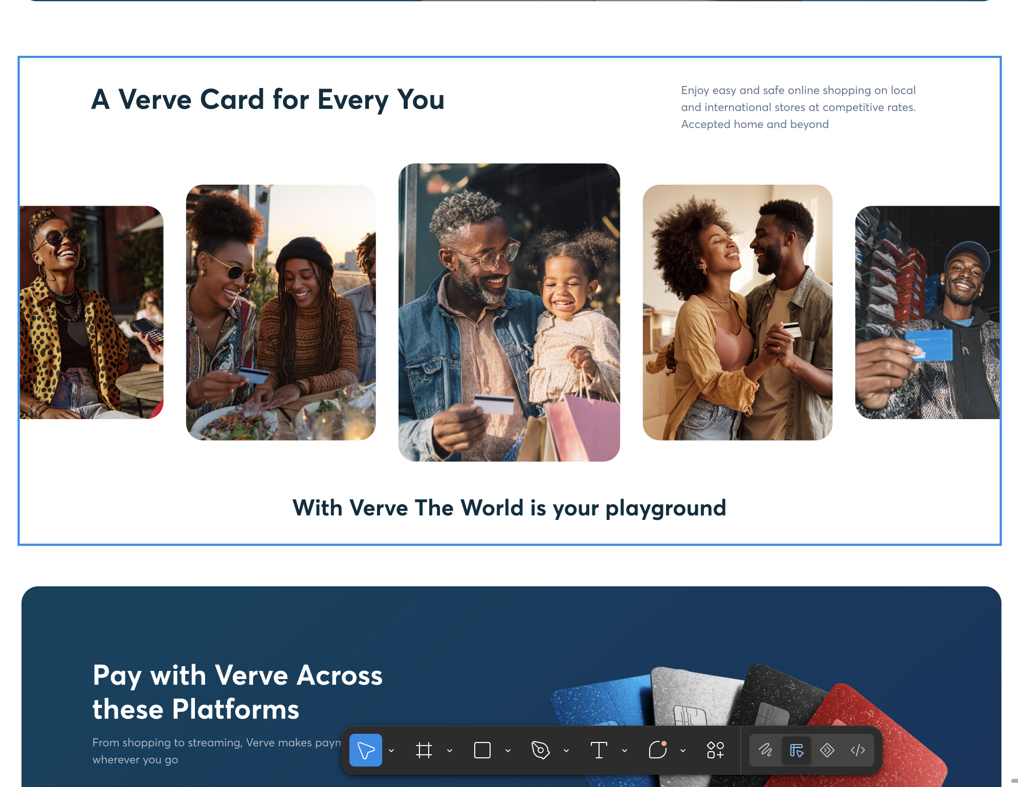 Image — Verve mobile app redesign
Key screens — home, payments, card management · 1600 × 900px
Image — Verve mobile app redesign
Key screens — home, payments, card management · 1600 × 900px
Outcomes
Before and after — what shifted
The 6-month project delivered a fully unified Verve ecosystem for the first time since the brand's inception. All six products launched with a shared visual identity, a single token-based design system, and consistent component usage across every touchpoint.
The 73% brand confusion rate among merchant users — the problem that had catalysed the project — was eliminated as a structural issue. Users could now recognise every Verve product as part of the same family from the first screen, before completing a single task.
The 4.2× support ticket ratio from navigation confusion dropped significantly in the post-launch monitoring period, as the consistent navigation structure and predictable UI patterns reduced the incidence of UI-driven errors.
"This is the first time I've looked at our merchant portal and the website and thought — yes, that's the same company."
— Internal stakeholder review, Interswitch Group, 2024.
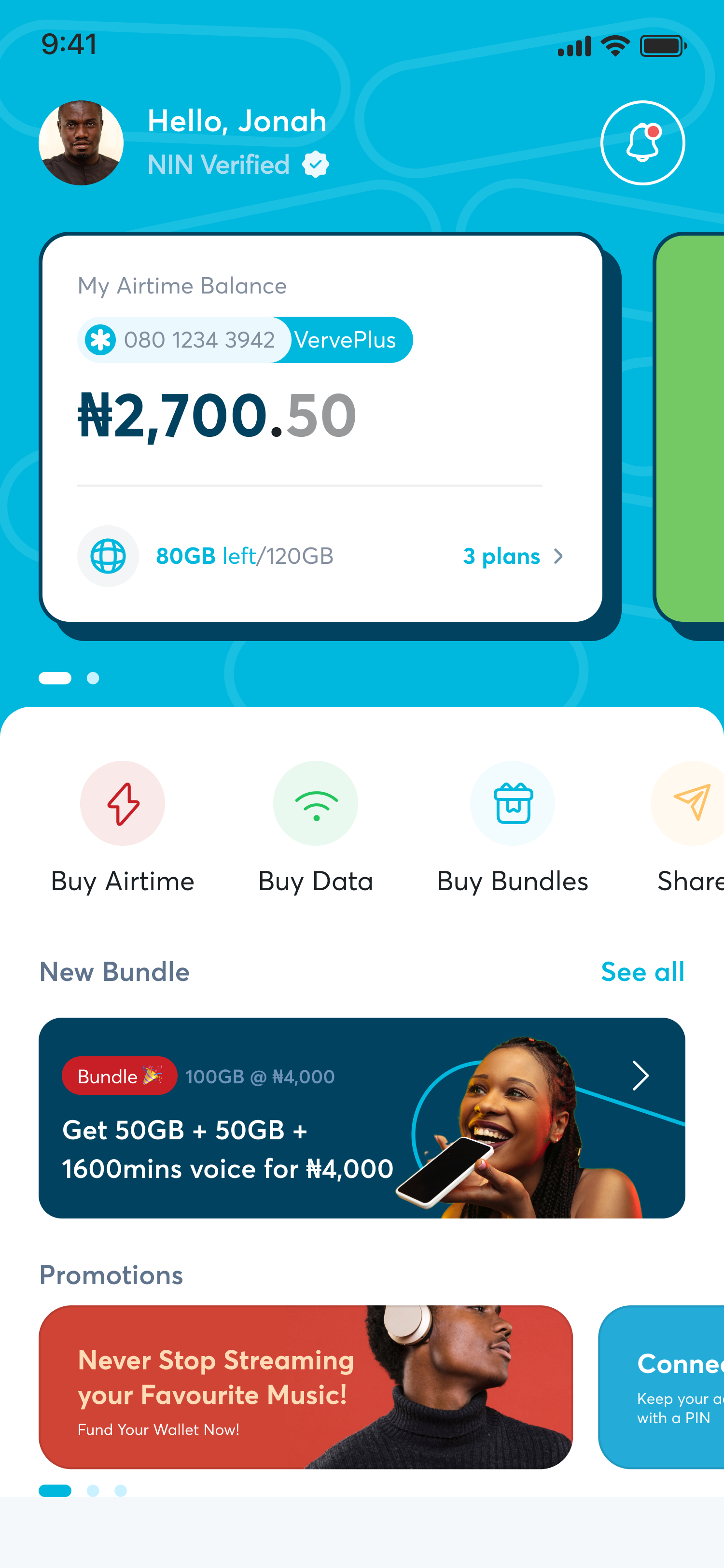 Image — Before & after comparison
Any product — old vs new side by side · 1600 × 900px
Image — Before & after comparison
Any product — old vs new side by side · 1600 × 900px